0
Under review
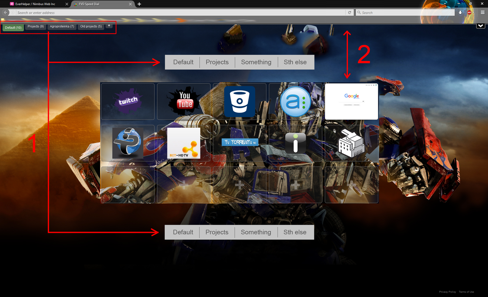
Groups as navigation, and custom top margin
1) Make top navigation into pagination-like tabs, and allow it to be placed above or below dials (or both). Make font and color of it customizable
2) Add customizable margin between dials and the top of the window.

Customer support service by UserEcho

We plan to move folders to right vertical side bar http://nimb.ws/a0AnMd
What do you think?
Well the screenshot you provided looks prettier than the current solution, but honestly, functionally I don't think it resolves the problem of groups beeing too far to the left (or right) of the dials which are centered, especially on big screens. I'm sure that would work in some cases where you have 10+ groups and it makes sense to position them vertically rather than horizontally, so why not just make it optional to put the groups above/below/left/right of the content? In my opinion, for best UX they should be placed as close to the dials as possible. So if placed vertically like you're suggesting, they shouldn't be touching the side of the screen, they should be close to the side of the dials
Ok, we will adjust it in feature build. Thank you